Friday 8 May 2009

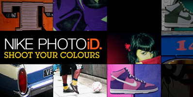
Nike photid


Nike photid is the latest mobile phone based piece of design for creative culture addicts, the idea is that your out and about and see a colour scheme you like any where where its a piece of graffiti on a wall or a poster on a bus stop and you might just happen to think "that would be a really cool colour way for a pair of shoes" but how do you find those colours again?, well now with nike photoid all you have to go is take a photo of the colours and send it too your countrys special number and you will recieve a reply with your custom colour matched nike and a code to enter online so you can buy them.


I think that the idea is great and it might even be abit late arriving with the idea of colour matching sice we have been able to do it with paint and kitchen furniture colours for a while now and this makes it accesable to everyone, the idea really makes nikes custom shoes that have been around for a while more well known, and it makes it accessible the idea of custom shoes by word of mouth sounds very expensive and so utilizing mobile phones makes peopel realize its not at out of reach as they thoght because its been aimed at people with phones which is almost everybody now, the advert isnt aimed as celebrity's who can take a pile of fabrics into a shop and leave with a pair of overpriced shoes it is universal and so doesnt alienate people.
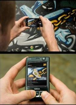
I also think the advert is very effective the beat boxing soundtrack adds to the customizing image and it gives the feeling of that anyone can do it to and makes you think "i could do that" and this feel is shown in the demonstration of how it works it just looks the easiest thing in the world to do they don't try to make the process more impressive than it actual is the just keep the feeling that its something quite special that you can have a pair of one of shoes but that it is for everyone not just people who can afford it, because the last thing you want to do it create a hugely sort after product that everyone can have and then give peopel the impressionthat it's out of there reach with the way you advertise it.

Coca-Cola identity

The coca-cola identity re brand by turner Duckworth of London and San Francisco has the ideas to strip on eof the worlds biggest brands to its core essentials. and i think this is a statement on how company's that have become world recognisable by just a logo are relying to much on how much money they can throw into a project and get the greatest piece of motion graphics imaginable and this project is about finding the true image that is coca cola and what they were all about and how they got where they are today without the money and endless advertising possibilities.
This design it a huge stack of coke bottles with gaps to build the classic coke logo.


I think that what they have created in this campaign is extremely powerful and have captured exactly what coke is about as far as a brand and this is the amazing font and design of there logo along with the classic bottle shape which is something that for a while i would say is something that wasn't a prominent part of coca cola in this country and to me was something that i personally related to holiday as it was the only place i would see the classic bottle and not a can.
I would say that the coca cola logo is possibly the best piece of type design ever created and making it once agaain the most important thing about the design and not just something stuck oin the corner of a over the top piece of cgi and for me personally it works, the first thought when you see this capaign in coke the drink not how impressive what you are watching is and think its a movie trailer and the simplicity of the design are very classy adn represent the style that is represented in the coke logo.

My favourite image from the campaigne is the truck designs, the simple idea of painting a part of the truck to look like a pickup truck dragging a huge bottle of coke whic i think while stil keeping in the minimal clean theme it still coneys both mesages of coke that they are a serious brand with a timeless classic look that dont need to be overly impressive, adn it is also a design that brings a smile to your face and gives the message of happiness and that coca cola bring this happiness even if there dragging it behind a truck.

Nokia Vine

Nokia's new vine application is the next level of social networking that does all the work for you the idea of nokia vine is that it will document the actions you do one a journey much like on twitter how you can update anyone in the world with what you are doing at any time you want to, vine on the other hand is more multimedia based and gives people an extra insight in what you want to show them because as you are on a journey if you turn on your nokia phones music player using gps the phone documents where you are when you start listening to your music and upload a path of your route onto your online profile which will end when you stop listening to music, other features it has is when you take a photo or a video it will automatically upload the photo you have taken to the website with a tag on your map for where you were at that moment in time so people can see where abouts what you have taken a photo of is.


I really like this idea about it uploading pictures and videos for you and documenting a specific journey with all the things you have done, and it reminds me of the research methods Damien Gascoine talked about in his lecture that we should always be researching and be taking notes through out our daily lives and i think this is a very interesting way to document things that we have been doing and it also takes down the risk of actually documenting something and losing it but with vine you will always be able to find out where you or a particular item was in the world.

Syrup

After finding the hope.act.change website i found out it had been created by a company called syrup so i decided to do some research into them to see what there other work was like and if it was as successful as that one.

The company are based in New York and Stockholm i had to do some digging to find out about them and who they were because this kind of information wasn't available on there website but when i did eventually find some information that they had written about them selves in a bio, and i can defiantly say that it sounds like a great nice place to work, they describe themselves as ''Our business is not run like an office. Syrup is a live/work loft'' and "We have jam sessions in between brainstorming, soccer games before coming to work, and the best espresso machine money can buy."and this makes the place sound like a lot of fun and a really creative environment and i think this is something you get the feeling of in there website which is a simple flash site with ten thumbnails of work on a background of cartoony drawn items like tennis and football and there is a cool feature that as you scroll to the edges of the screen the website moves with your mouse which has no real purpose but on this site it feels right and it lets you explore all the drawn items on the background.

There work ranges from web design and online campaigns to television advertising and is all very clean and minimal and there is never a screen that feels overpowering or in your face all the information in the work is very subdeued in a well thoguht out and calssy way that doesnt shout at you to look at it it almost is so refined and classy that it expects you to take a closer look, one thing i have noticed about there work is that they have a theme of using shapes such as diamonds and patterns built up in this way especially when creating buttons for a website and i think this looks really good because the buttons dont stand like they sometimes can on a website so do not take away from the page that is often putting emphasis on a photo in the picture. there diamond theme also can be seen in there graphic work in the following photo where the lights have been made into a the distinctive diamond pattern and is definatly a interstign thing to keep running through different campaigns.

Thursday 7 May 2009

Zoo York Roaches

I dont quite know how to describe this particular promotion form New york based urban clothing company zoo york the videos started of as a viral which eventually became a full campaign of adverts all based around cockroaches which i assume is to go along with the zoo york slogan which is "unbreakable" and i guess the only creature that would survive a nuclear war is pretty unbreakable, what i think is great about this campaign is that it is the kind of advertising that is just unleashed on the public wether they want to be a part of it or not and what they have done is so random and strange that people on the streets cant take notice, what the company do is spray paint the company logo onto hendreds of cockroaches adn there bmx and skate team go out into new york and jsut realease them onto the public which while is a very cheap form of puttign the company logo out on teh streets with the roaches working as little walking advertisements adn aslo get the company a huge amount of the publicity for thrownign roaches onto un suspecting new yorkers which would have no doubt be nothing nice said about what they did nut then againtheres no such thing as bad publicity.


Harvey Nichols sale posters

Out of the whole creative review annual 2009 I found myself being constantly drawn too this set of posters no matter how many times i flicked through i found my eye was caught by them every time and there was something that i just found extremely captivating about them and i feel they are one of the best sets of design for advertising i have seen for a while and i think that its the fact that one of the reasons is they are only advertising a clothes store sale and are not part of a huge campaign by a big corporate company they seem like they are more about an idea than how much money has been put into making the most impressive thing ever.


I think that the idea to use manikins is really effective and very different approach because it would have been much easier to hire some models and tell them to look scared, i think they have been really successful to make you feel that the manikins are fearing for there safety from the onslaught of shoppers coming at them because of the careful manipulation of there body's in the way that the poses are not just hiding they actually look like they are terrified and trying to defend themselves, there physical form also looks very human due to the fact that the manikins have some features specially altered like the red dress manikin has an outstretched fingers in a stop hand gesture, i think the fact that they are not human works to make you get the emotion feelings because they have no faces and so rely on body language even more and in these posters it is very strong.

I also think the choice of type holds the posters together well and the choice not to have a slogan or line about how good the sale is and keeping the information minimal makes the image stronger because the info isn't taking anything away from the manikins. the colour scheme is perfect as well by have the dark background with dark takes really makes the bright clothes on the manikins pop out and immediately make the manikin the focal point.

stolen design ideas?


After being drawn to a series of posters in creative review created by DDB London for the Harvey Nichols sale, the posters featuring manikins diving for cover and looking scared at the prospect of a sale and i decided i wanted to write about them for my blog and went online to find abit more info and i came across the following site which is a french advertising site and someone had posted this piece about pieces of design that they think are just copy's of other pieces of design.

http://www.joelapompe.net/category/print-outdoor/retailers-furniture/

The article in the site does feature the Harvey Nichols posters and while they are the same with the use of manikins in a state of self defense and terror i have to say that i feel the Harvey Nichols posters are much better as the other company's posters the manikins have faces and i think that they just make it over the top and don't have the same emotional feeling the Harvey Nichols poster give of so personally i don't think they are a direct copy but may have been influenced and actually done much better, and this made me think is anything really 100% original anymore and what do we have to do for someone to not to accuse us of stealing an idea for example my fmp can be said to be similar to the Audi rhythm of lines project but i have put my own spin on the idea and the only reason i have done something similar is because i was so impressed by it in the first place so on the issue brought up by the website my own opinion is that there is stealing in design only designers trying to be like the the people and work that has inspired them and that is what keeps the creative industry going and getting people involved when they see something that impresses them so much they have to have a go.